Microsoft 365 Copilot’s Redesign Turns the Prompt Box Into a Runtime

Microsoft’s redesigned Microsoft 365 Copilot is easy to mistake for a UI refresh. Cleaner app, bigger prompt area, faster loading, better navigation — fine, ship it. But the actual move is larger than a prettier assistant. Microsoft is turning the prompt box into a work surface, and that changes what Copilot is allowed to be.
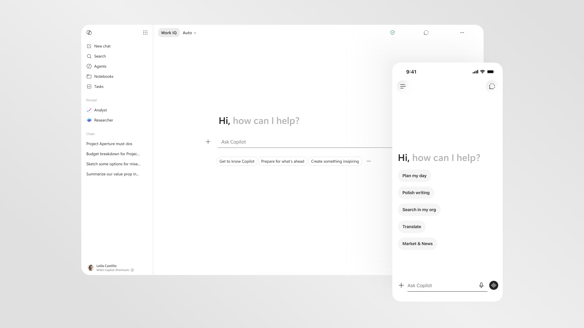
The company describes the new experience as a shift from a static text box to a “task-aware workspace.” That phrase is doing real work. A text box waits for instructions. A workspace has state, memory, context, tools, controls, and a relationship to the artifact in front of you. Microsoft wants Copilot to stop behaving like a chatbot parked next to Office and start behaving like an execution layer inside Word, Excel, PowerPoint, Outlook, and the broader Microsoft 365 app.
The redesign gives the prompt line more room, surfaces tools and controls based on the task, and creates a more consistent Copilot entry point across Microsoft 365 apps. The Copilot app now has a left navigation pane for agents, conversations, and history, plus shared pinning and more room for session recall. The prompt surface can expand into the experience, preserving pasted structure and inline formatting before the user sends the request. In the apps themselves, Copilot can show up inside the canvas — in a paragraph, cell, or slide — instead of only as a side pane waiting for a vague instruction.
The prompt box was always too small for the job
Most enterprise AI products still ask users to do too much translation. The user knows the task imperfectly. The document contains some of the context. The spreadsheet contains structure. The meeting history contains politics. The email thread contains constraints. The organization has permissions, labels, acronyms, and source-of-truth systems. Then the AI product presents a blank prompt and expects the user to reconstruct all of that in prose.
That is why so many Copilot-style deployments stall after the novelty phase. The model may be capable, but the interaction design makes the user become the integration layer. Copy this from Outlook. Paste that from Teams. Explain the spreadsheet. Clarify the deck. Mention the meeting. Then review the answer because the assistant probably missed the buried constraint. Eventually muscle memory wins and the user goes back to doing the work manually.
Microsoft’s redesign is a bet that the interface should carry more of that context burden. Work IQ is the named intelligence layer behind the pitch. Microsoft says it draws on emails, files, chats, meetings, and broader work signals, while remaining visible when active and directly controllable. It can support quick responses when appropriate and deeper reasoning — including model choice — when the work requires it. In a separate technical framing, Microsoft describes Work IQ as three layers: data, context, and skills/tools, grounded in Microsoft 365 tenant data, Graph, connectors, semantic index, memory, and eventually broader Dataverse, Power Apps, and Dynamics context.
That is the right direction, but it raises the stakes. A more context-aware assistant is only better if the context boundary is correct. Permissions hygiene, sensitivity labels, connector scope, memory settings, audit logs, and model-routing policy are not admin afterthoughts. They are product features now. If Copilot can see more, suggest more, and act closer to the artifact, then “who can see what” becomes “what work can the AI influence.” That is a different blast radius.
Latency is not polish; it is capability
Microsoft included performance numbers that deserve more attention than the design screenshots. The redesigned Copilot app loads more than twice as fast, with load times reduced by more than 50% in March 10–17, 2026 customer testing across about 11.06 million treatment users and 11.16 million control users. Complex chat first-token response times improved by 10% at the 95th percentile. Microsoft also says new in-app experiences drove Copilot usage increases of 27% in Word, 33% in Excel, 43% in PowerPoint, and 30% in Outlook.
Those numbers are not just “nice UX.” Latency defines whether an AI assistant becomes part of the work rhythm or remains a modal tax. A slow Copilot is consulted at the end, after the user has already done the thinking. A fast Copilot can be used while the task is still forming. That matters because the highest-value enterprise workflows are not one-shot prompts. They are messy loops: draft, inspect, revise, compare, format, ask a follow-up, incorporate review, cite a source, update a slide, check the numbers, send the thing.
The usage increases are more ambiguous. More Copilot usage in PowerPoint or Outlook may mean the new affordances are lowering friction. It does not prove better work. A 43% increase in PowerPoint usage could be a productivity win, or it could be more generated slides for humans to clean up. The useful response is not skepticism for sport; it is instrumentation. Measure time to first usable draft, accepted edits, revision cycles, review debt, compliance mistakes, source-grounding failures, and whether users voluntarily return to the workflow after the pilot team stops nudging them.
Model routing is hiding behind the friendly interface
The other quiet shift is model choice. Microsoft says Work IQ can support deeper reasoning and the ability to choose between AI models. Elsewhere, Microsoft has described Microsoft 365 Copilot as bringing models from multiple providers, including OpenAI and Anthropic, into Copilot experiences and applying the right model for the task while allowing user choice.
That means the redesigned prompt surface is also a model-routing surface. When a user asks for deeper reasoning on a sensitive document, which model runs? What data reaches it? What logs are retained? Does the organization’s policy treat OpenAI-backed and Anthropic-backed paths differently? Is there a cost difference? Can an admin restrict model choice by data class, department, or workflow? Those questions used to live in architecture reviews. Now they sit behind a friendlier prompt box in the Office apps people use all day.
Practitioners should evaluate the redesign accordingly. Do not pilot it as a cosmetic update. Pilot it as an execution surface for work that depends on context: board decks, forecast spreadsheets, procurement documents, performance review cycles, support escalations, sales handoffs, policy drafts, and executive summaries. Start with workflows where the artifact matters and the cost of wrong context is visible. Then test whether Copilot reduces handoff friction without creating new review debt.
Before expanding scope, tighten the boring things. Clean up overshared files. Review connector permissions. Validate sensitivity labels. Decide whether memory is appropriate for each user group. Define which agents can appear in which contexts. Document model-choice policy. Train users to begin from the artifact and task, not from generic “write me something” prompts. If Copilot is becoming a workspace, then the workspace needs house rules.
Microsoft’s redesign is interesting because it makes UX, governance, and model routing the same product problem. The prompt box is no longer just where a user types. It is where context enters, tools appear, agents gather, models are selected, and work starts to move. That is useful. It is also exactly why enterprises should stop treating Copilot adoption like chat training and start treating it like a new operating surface for knowledge work.
The better textarea was never the point. The point is that the textarea is becoming a runtime.
Sources: Microsoft 365 Blog, Microsoft Tech Community on Work IQ, Microsoft Copilot connector docs, Microsoft Graph docs